
Is Your Website Easy for Customers to Use?
Introduction
When someone visits your website, they usually arrive with a purpose. They may want to understand what you offer, compare your services, find an answer to a question or decide whether they want to contact you.
How easily they can achieve that purpose has a significant influence on what happens next.
If your website is confusing, difficult to navigate, slow to respond or awkward to use on a mobile phone, potential customers may simply leave and look elsewhere. They are unlikely to spend time working out how your website works.
This is where user experience becomes important.
Good user experience isn’t about adding clever features or elaborate design. It is about making your website clear, useful and easy to use. Visitors should be able to understand where they are, find the information they need and recognise what they can do next.
These improvements can benefit more than your customers. Many of the characteristics that make a website easier for people to use — clear structure, useful content, mobile-friendly design and good performance — can also support its search visibility.
For a small business, the objective is straightforward: make it as easy as possible for potential customers to find what they need and take the next step.
Can Visitors Quickly Find What They Need?
One of the most important questions you can ask about your website is surprisingly simple: can a visitor quickly find what they came looking for?
Someone arriving on your site shouldn’t need to understand how you have organised your business before they can find the right information. Navigation should be clear, page headings should make sense and important services shouldn’t be hidden several clicks away.
Think about the questions a potential customer is likely to have. What do you offer? Is it suitable for them? How much does it cost, if pricing is appropriate to show? Why should they choose your business? How can they contact you?
Your website should make the answers easy to find.
Clear navigation is part of this, but so is the structure of individual pages. Descriptive headings, concise sections and relevant links can help visitors scan a page and move quickly to the information that matters to them.
Calls to action are important too. Once someone has found what they need, make the next step obvious. That might be contacting you, requesting a quotation, booking a consultation or exploring another relevant service.
A good website shouldn’t make potential customers work to understand what to do next. The easier you make their journey, the more opportunity you have to turn a visitor into an enquiry or customer.
Make It Easy to Use Your Website on a Mobile
For many potential customers, their first experience of your business website will be on a smartphone.
A website that looks good on a desktop computer can still be frustrating to use on a smaller screen. Text may be difficult to read, buttons can be too small to tap comfortably, navigation may become confusing, and forms that work perfectly well on a desktop can become unnecessarily difficult to complete.
A mobile-friendly website should adapt naturally to the available screen size. Visitors shouldn’t need to zoom in, scroll sideways or struggle to select links and buttons.
Pay particular attention to the actions that matter most to your business. Can someone easily find your telephone number? Can they open the navigation, view your services, complete an enquiry form or book an appointment without difficulty?
Content also needs to work well on smaller screens. Long, uninterrupted blocks of text can be difficult to read, so clear headings, shorter paragraphs and a sensible page structure become even more important.
Don’t assume that because your website is described as responsive it automatically provides a good mobile experience.
Use it yourself on a real phone. Try completing the same tasks you expect a potential customer to complete. Small frustrations become much more obvious when you experience the website in the same way your customers do.
Making your website easier to use on mobile isn’t an optional extra. It is a fundamental part of providing a good experience for today’s website visitors.
Slow and Frustrating Websites Lose Customers
Website performance is part of the experience your business provides.
If a page takes too long to load, buttons don’t respond quickly or content suddenly moves while someone is trying to use it, frustration can build very quickly. Some visitors will wait, but others will simply return to the search results and try another business.
Speed is particularly important on mobile devices, where visitors may be using slower connections and expect to find information quickly.
Large images, unnecessary scripts, poorly configured plugins, slow hosting and other technical issues can all affect website performance. Sometimes the problem develops gradually as more content and functionality are added to a site.
Performance isn’t only about how quickly the first part of a page appears. The website should also respond promptly when someone interacts with it and remain visually stable while it loads.
You don’t need to understand every technical measurement to recognise that these things affect your customers. Try using your own website as a visitor would. Open important pages on a phone, navigate between them, use the menu and complete an enquiry form.
If the experience feels slow or frustrating to you, it may feel exactly the same to a potential customer.
Improving website performance can remove unnecessary obstacles between someone arriving on your site and taking the action you want them to take.
Clear Content Makes Decisions Easier
Good user experience isn’t only about design and navigation. The words on your website play an equally important role.
Potential customers usually arrive with questions. They want to understand what you offer, whether it is relevant to them and why they should consider choosing your business.
Your content should help them reach those answers quickly.
Use clear headings that describe what each section is about. Keep paragraphs manageable and avoid unnecessary jargon, particularly when customers may not be familiar with the terminology used within your industry.
Service pages should explain the service from the customer’s perspective rather than simply describing what your business does. What problem does the service solve? Who is it for? What does it involve? What can the customer expect to happen next?
The structure of the page matters too. Put important information where visitors are likely to need it and provide relevant links when they may want to explore a subject in more detail.
Finally, make the next step clear. If you want someone to contact you, request a quotation or book a consultation, don’t make them search for a way to do it.
Clear, useful content reduces uncertainty. The easier it is for visitors to understand your business and decide whether you can help them, the easier it becomes for them to take the next step.
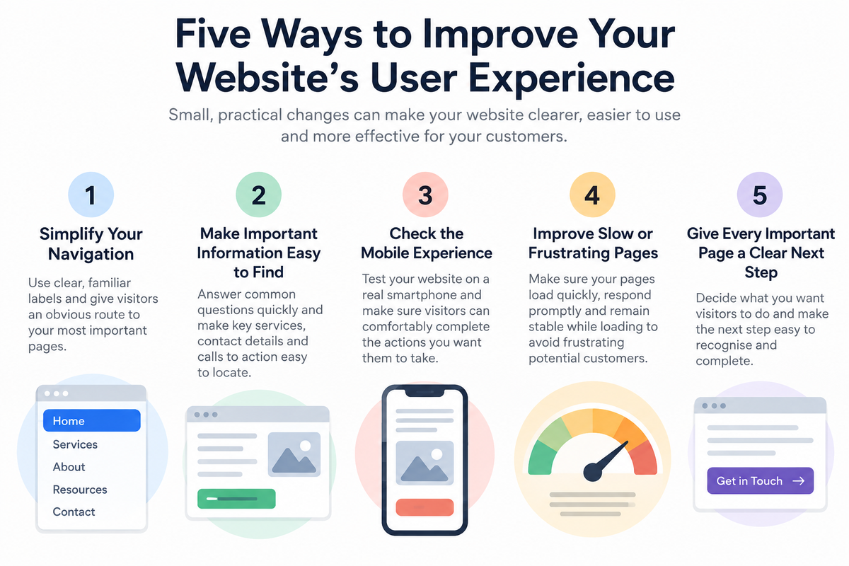
Five Ways to Improve Your Website’s User Experience
Improving user experience doesn’t necessarily require a complete website redesign. Small, carefully chosen changes can often remove the frustrations that make a website difficult to use.
Here are five practical areas to review:
- Simplify your navigation
Make sure your main menu uses clear, familiar labels and gives visitors an obvious route to your most important pages. Remove unnecessary choices that make navigation more complicated. - Make important information easy to find
Think about the questions potential customers are most likely to ask and make sure the answers aren’t buried deep within the website. Important services, contact information and calls to action should be easy to locate. - Check the mobile experience
Test your website on a real smartphone. Look at the navigation, text size, buttons, forms and important pages. Make sure visitors can comfortably complete the actions you expect them to take. - Improve slow or frustrating pages
Pay attention to pages that take too long to load, respond slowly or move around while loading. Performance problems can quickly undermine an otherwise well-designed website. - Give every important page a clear next step
Decide what you want visitors to do after reading each page. That might be exploring another service, reading related information, requesting a quotation or contacting you. Make that next step easy to recognise and complete.
The best way to review user experience is to stop thinking like the owner of the website and try to use it as a potential customer. What seems obvious when you already know the site may be far less obvious to someone visiting it for the first time.
A Better User Experience Can Support Your Search Visibility
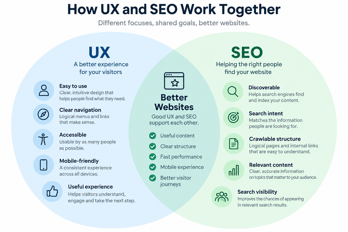
User experience and search engine optimisation are different disciplines, but there is considerable overlap between them.
Many of the improvements that make a website easier for people to use also make it easier for search engines to understand and present its content.
Clear page structures and descriptive headings help organise information. Useful content helps answer the questions people are searching for. Logical navigation and internal links make related pages easier to discover. Mobile-friendly design and good website performance contribute to a better experience regardless of how someone finds you.
The important point is not to design your website for search engines at the expense of your customers.
Trying to force keywords into pages, creating unnecessary content simply to target search terms or adding elements solely because you believe they will improve rankings can make a website less useful rather than more effective.
Start with the person using the website. Make it clear what each page is about, provide genuinely useful information and make it easy for visitors to find what they need and take the next step.
Search optimisation can then support that experience rather than compete with it.
For a more detailed explanation of how these two areas work together, our Digital Strategy guide, UX and SEO: Creating Better Websites for People and Search, explores the relationship between user experience and search visibility in greater depth.
How Easy Is Your Website to Use?
When you work with your own website regularly, it can be difficult to see it from a potential customer’s point of view.
You already know where everything is, what your services mean and how visitors are supposed to move through the site. Someone arriving for the first time doesn’t have that knowledge.
An independent review can identify problems that may be making it harder for potential customers to find information, understand what you offer or take the next step.
Digital Direction can review your website from a user experience perspective, looking at areas such as navigation, page structure, content, mobile usability, performance and calls to action.
The objective isn’t to recommend change for the sake of it. It is to identify practical improvements that could make your existing website clearer, easier to use and more effective for your customers.
If you’re unsure how well your website is working for the people who use it, talk to us about a Website User Experience Review and find out where improvements could make the greatest difference.