

Designing Websites for a Mobile World
Using a website on a mobile phone is now an everyday part of how people search for information, research businesses, compare products and services, and make enquiries.
Responsive web design has consequently become a standard requirement rather than an optional feature. But simply having a website that adjusts to fit a smaller screen doesn’t necessarily mean it provides a good mobile experience.
A successful website needs to consider how people actually use it on different devices — what they need to find, how they navigate, how quickly pages load and how easily they can take the next step.
Responsive Doesn’t Always Mean Mobile-Friendly
Responsive design allows a website’s layout to adapt according to the size of the screen being used.
That’s an important foundation, but responsiveness alone doesn’t guarantee usability.
A website can technically fit a mobile screen while still having difficult navigation, overly long pages, small controls, intrusive elements or content that is awkward to read.
The objective should therefore be more than making a desktop website fit onto a phone. The mobile experience needs to be considered in its own right.
Design for Smaller Screens
Smaller screens force us to think carefully about what really matters.
On a large desktop display, there may be room for complex navigation, multiple columns and large amounts of supporting information. On a smartphone, space is much more limited.
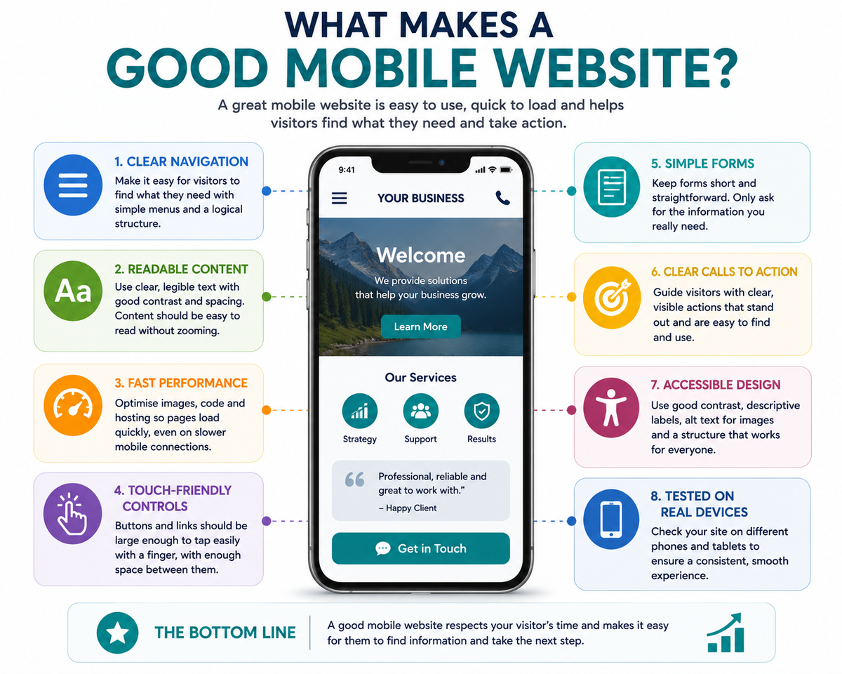
Good mobile design prioritises the information visitors are most likely to need. Navigation should be clear, headings should make pages easy to scan and important content shouldn’t be buried beneath unnecessary elements.
This doesn’t mean removing useful information from mobile users. It means organising and presenting that information so that it remains easy to understand regardless of screen size.
Mobile User Experience Matters
Using a touchscreen is different from using a keyboard and mouse.
Buttons and links need to be easy to select. Menus need to work comfortably on smaller screens. Text should be readable without zooming, and visitors shouldn’t have to scroll horizontally to see content.
Forms deserve particular attention. A lengthy or complicated form can be frustrating on a mobile phone, so businesses should consider what information they genuinely need from somebody making an enquiry.
Accessibility should also form part of mobile design. Clear layouts, readable text, sufficient contrast, meaningful labels and straightforward navigation can improve the experience for everyone.
Performance Matters Even More on Mobile
Website performance affects every visitor, but it can become particularly noticeable on mobile devices where connection quality and speed may vary.
Large images, unnecessary scripts, video and poorly optimised page elements can all increase the amount of information a visitor has to download.
Optimising images, keeping pages technically efficient and avoiding unnecessary complexity can help pages load more quickly and provide a smoother experience.
Performance shouldn’t be treated purely as a technical measurement. A faster website means less waiting for the person trying to use it.
Mobile and Search Visibility
Mobile usability also forms part of the wider picture of search visibility.
Search engines need to be able to access and understand website content effectively across devices. Clear structure, useful content, good technical performance and a consistent experience all contribute to a strong foundation for Search Engine Optimisation (SEO).
Mobile responsiveness by itself doesn’t guarantee better search rankings. Search visibility depends on many factors, including relevance, content quality, technical health, authority and competition.
However, a website that performs poorly for mobile users is unlikely to provide the kind of experience businesses or search engines ultimately want to deliver.
Make It Easy for Mobile Visitors to Take Action
Mobile visitors are often looking for something specific and may want to act quickly.
They might want to telephone your business, send an email, complete an enquiry form, start a WhatsApp conversation, request directions or book an appointment.
Those actions should be easy to find and straightforward to complete.
Telephone numbers can be made clickable, forms can be kept concise and calls to action can be positioned where they make sense within the customer journey.
The aim is not to fill every mobile screen with buttons. It is to make sure that when someone decides to take the next step, the website doesn’t put unnecessary obstacles in their way.
Test on Real Devices
Website editors and browsers provide useful tools for previewing how pages should appear at different screen sizes, but previews don’t tell the whole story.
Whenever possible, test important pages on real mobile devices.
Try the navigation. Follow links. Complete forms. Use the website in portrait and landscape orientation. Check whether buttons are comfortable to select and whether important content is easy to read.
Testing on different devices can reveal usability problems that aren’t immediately obvious when viewing a responsive preview on a desktop computer.
The question isn’t simply, “Does the website fit the screen?” It is, “Can somebody comfortably use it?”
Mobile Design Is Simply Good Website Design
Mobile responsiveness was once discussed as an additional feature that businesses needed to add to their websites. That distinction now makes much less sense.
People move between smartphones, tablets, laptops and desktop computers throughout the day. They expect websites to work effectively regardless of how they choose to access them.
Good professional website design therefore considers content, navigation, accessibility, performance and user experience across different screen sizes from the outset.
A website that works well in a mobile world isn’t simply a mobile-responsive website. It’s a website designed around the needs of the people who use it.